COVID-19 Transmission Analysis
SEIR Epidemic Model for COVID-19 Transmission Rate by Runge-Kutta Method
The primary aim of my research is to provide a comprehensive and precise solution to the SEIR model using the 4th-order Runge-Kutta method. This method, renowned for its accuracy and efficiency, will allow us to predict the dynamics of infectious diseases with greater precision. By applying this numerical method, we aim to overcome the limitations of basic reproduction numbers and provide a more realistic representation of disease spread in a population which could potentially guide public health interventions and policies.

As we all know, COVID-19 is an infectious disease caused by the SARS-CoV-2, which was first identified in an outbreak in China, Wuhan. It is the first pandemic of the 21. century, which affected the whole world economy and the health industry. Most people who are infected by the virus experience moderate illness and recover without any special medical help. And just like some other diseases, COVID-19 can spread from an infected person’s mouth or nose in small liquid particles. But unlike the other infectious diseases such as cold, or flu; anyone who gets sick with COVID-19 can become fatally ill or die at any age.
Mathematical Modes
COVID-19 models are tools that use mathematical equations to predict the virus’s spread and impact. These models play a key role in guiding health policies and strategies. The CDC (Centers for Disease Control and Prevention) uses these models to estimate the potential effects of COVID-19. The forecasts are based on various modeling techniques, different types of data (like COVID-19 data, demographic data, mobility data), and the estimated effects of interventions like social distancing and mask usage. Various mathematical models, including SIR, SIS, SEIS, SEIR, Jacskon, Keshet, and numerous others, are employed for the examination of epidemic diseases.
SEIR Model

SEIR is a mathematical model that divides the population into different stages of infection, which at last creates a structure that allows a more detailed representation of disease progression, compared to other simpler models. It is a useful way of fitting real-world data into the model, enabling a comprehensive understanding of disease dynamics. On the other hand, the model can be extended to additional parameters, such as age or variants in transmission rates over time. This flexibility can be very useful in order to create different scenarios. Given its simplicity in explanation, the SEIR model serves as a practical approach in various fields, including education, communication, and politics. This ensures that policymakers and the general population can comprehend the fundamental concepts related to disease spread and its associated control measures.
Methodology
The mathematical model of SEIR is denoted as follows:

Where the parameters:

With the initial conditions;

We note that this model has a different form from other SEIR models since the transmission rate of infection is separated as two groups, whereas the original model only consists of one group (people who are labelled as infected).
Based on the data disseminated by the World Health Organization, individuals afflicted with the disease can be bifurcated into two categories: asymptomatic and symptomatic. Both groups transmit the disease to other people, and both groups either recover or lose their lives. And original SEIR model is based on symptomatic group. So we can say that our model gives a more proper idea about the COVID-19 case.
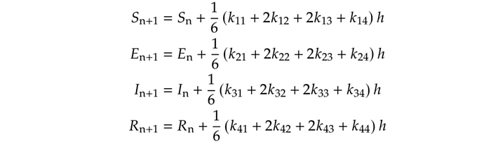
Transformation Runge–Kutta Equations to Our SEIR Model
From the general iterative formula for the Runge–Kutta method; S(T), E(t), I(t), and R(t) can be modified as follows:

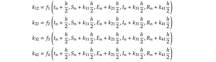
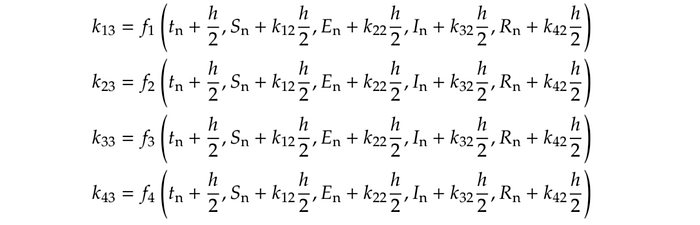
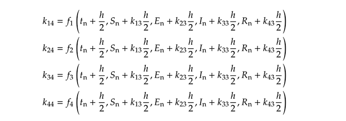
From the derived equations, we obtain:
Simulation
We consider the COVID-19 outbreak in the worldwide, so the data will be compatible in general. After we solve our model by using the fourth-order Runge-Kutta method, we can combine it with collected data since our system is formulated logically with our parameters.

Where with the initial conditions; S(0) = 7610026000, E(0) = 80000, I(0) = 24545, R(0) = 907 with step size as 0.1. Using our model, the following values for S(1), E(1), I(1), and R(1) can be calculated by using the necessary MATLAB codes.
You can see the whole MATLAB code from this link.
github.com/baranalidogan/seir-runge-kutta
Results and Discussion
We have our simulation result of the 4th-order Runge-Kutta Method as:

The results are then plotted for each of the SEIR components over time. The blue squares on the plots represent the data points at every 50th-time step. The plots provide a visual representation of how the disease spreads and recovers over time.
The x-axis represents time, and the y-axis represents the number of individuals in each group (S, E, I, R). The top plot shows the number of susceptible (S on SEIR) individuals over time.
The y-axis ranges from 0 to 7 billion, which is close to the total global population. It shows a steady decrease in the susceptible population over time, which is expected in an epidemic as more individuals get exposed to the virus. The rate of decrease appears to be relatively constant, suggesting a steady rate of transmission from the infectious to the susceptible population. This could be due to a constant contact rate or a constant probability of transmission upon contact. However, without additional context or data, it’s difficult to draw more specific conclusions.
The middle plot represents the number of exposed (E on SEIR) and infectious (I on SEIR) individuals over time. The y-axis ranges from 0 to 5 billion. The plot shows an initial increase in the exposed and infectious populations, indicating the onset and spread of the epidemic. The peak of the curve represents the point at which the number of new infections starts to decrease, which typically occurs when a significant portion of the population has already been infected and hence the number of susceptible
individuals has decreased. The subsequent decrease in the exposed and infectious populations suggests that individuals are moving from these compartments to the ‘Recovered’ compartment, either due to recovery or death. The exact interpretation would depend on whether your model includes mortality.
The bottom plot shows the number of recovered (R on SEIR) individuals over time. The y-axis ranges from 0 to 200,000. The plot shows a steady increase in the recovered population over time. This is expected as individuals recover from the disease. The rate of increase appears to be relatively constant, suggesting a steady recovery rate. However, the rate of increase seems to slow down towards the end of the simulation period. This could be due to a decrease in the infectious population (as observed in the middle plot), resulting in fewer new recoveries.
These results provide valuable insights into the spread of COVID-19 and can be used to inform public health policies and interventions. However, it’s important to note that these are simulation results based on a simplified model and specific parameters. Real-world data may show different trends due to various factors not accounted for in the model, such as social behavior, government interventions, and variations in the virus itself.
- Public Health, 28 May 2020 Sec. Infectious Diseases – Surveillance, Prevention and Treatment Volume 8 – 2020, https://doi.org/10.3389/fpubh.2020.00230
- An SEIR Model for Assessment of Current COVID-19 Pandemic Situation in the UK, Peiliang Sun, Kang Li https://www.medrxiv.org/content/10.1101/2020.04.12. 20062588v1
- Analysis and Prediction of COVID-19 based on the SEIRV Model, 022 IEEE 7th International conference for Convergence in Technology (I2CT), https://ieeexplore.ieee.org/document/9824297/authors#authors
- Coronavirus Disease (COVID-19), WHO, https://www.who.int/health-topics/coronavirus
- https://advancesincontinuousanddiscretemodels.springeropen.com/
articles/10.1186/s13662-020-02952-y - Epidemic Model Guided Machine Learning for COVID-19 Forecasts in the United States , Difan Zou, Lingxiao Wang, Pan Xu, Jinghui Chen, Weitong Zhang, Quanquan Gu, 2020
- SEIR model for COVID-19 dynamics incorporating the environment and social distancing , Mwalili et al. BMC Res Notes (2020)
